Arts
Exhibit
Radical Visions

The exhibition’s opening image says it all.
Vintage Streisand in an endlessly repeating 42-second video clip from her 1966 CBS special Color Me Barbra. Her prim, organdy-aproned French-maid costume morphs into a sparkling, clinging op-art evening gown as she darts like a butterfly around the modern wing of the Philadelphia Museum of Art, belting out that old, familiar anthem of liberation: “Gotta move, gotta get out/ Gotta leave this place, gotta find some place/ Some other place, some brand new place…. Some place where I can just be me….”
When you turn from this dazzling performance (after watching it maybe 17 times) to read the accompanying wall text, you will discover how completely it sums up the endlessly surprising, thought-provoking and nostalgia-inducing exhibition “Revolution of the Eye: Modern Art and the Birth of American Television.” Streisand’s portrayal of finding her true self in the world of avant-garde art is a perfect metaphor for the way the pioneers of American television—many of whom were, like Streisand, young and Jewish—borrowed from cutting-edge art and design to create what became, and arguably remains, the world’s most influential medium.
I experienced “revolution of the eye”—a phrase Marc Chagall coined upon arriving in Paris to capture the visual impact of the city where “the sun of Art shone”—at New York’s Jewish Museum, where it was exhibited through September. The show, organized with the collaboration of the Center for Art, Design and Visual Culture, University of Maryland, Baltimore County, is currently at the NSU Art Museum in Fort Lauderdale, Florida, through February 28 and will travel to other venues.
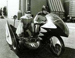
The exhibit is a revelation on so many levels, it’s hard to know where to begin. Who knew, for instance, that Rod Serling, creator of The Twilight Zone, was deeply influenced by Surrealism or that Ernie Kovacs’s wacky skits might have sprung straight from Dada? Who knew that works by artists such as Georgia O’Keeffe and Alexander Calder inspired some of the sets for the Dinah Shore Show? And you may recall the comic book look of the Batman television series but, the exhibit points out, it is associated with Roy Lichtenstein’s art. You will be able to ponder these relationships in all their eye-popping splendor here.
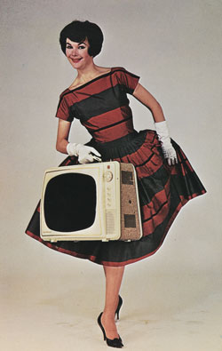
Moving from the late 1940s to the early 1970s, the exhibit describes how avant-garde art played a pivotal role in every facet of television production, from programming (Salvador Dali was a guest on What’s My Line?) to set and costume design and the look of opening credits for shows. Modern art influenced the architecture and interior design of network headquarters; marketing and promotional campaigns for programs and for the networks; and—often as compelling as any shows—the commercials made for advertisers (even ads for the televisions themselves, such as the one on display for the Electrohome Courier portable television).
The commercial and populist nature of the new medium made it a double-edged sword for artists. Some scorned television as low rent but at the same time welcomed the fresh outlet for self-expression—and income—it offered. It is no surprise that the two worlds sometimes collided. What is astonishing, however, is the extent to which they cooperated and the depth of the collaborations. As curator of the exhibition, cultural historian Maurice Berger, said, the more than 260 items displayed here represent only a fraction of material generated by the “vast numbers of artful and quality programs that, in the end, I did not have room to include.”

Although avant-garde art, according to art historian Thomas Crow, was an important influence on popular culture from the mid-19th century on, this exhibit is the first to explore its impact on TV’s development. Berger has been immersing himself in the subject since childhood. “I grew up in a low-income housing project on the Lower East Side [in New York],” he said. “My access to culture was constrained by my inability to afford most of it. Two forms were free: visual art, because museums waived admission fees for students; and television…. I always intrinsically viewed television as a form of visual art and wrote about it…for my junior high school newspaper. By 2009, with the publication of Lynn Spigel’s fantastic book [TV by Design: Modern Art and the Rise of Network Television, University of Chicago Press], the connection between the two was definitively confirmed. From then on I was committed to organizing an exhibition that would explore this little-known story.”
The exhibition design provides an evocative backdrop for the story. It unfolds more or less chronologically through eight sections staged by Abbott Miller, a graphic designer and partner at Pentagram, the world’s largest independent design consultancy, in collaboration with Berger, to suggest the atmosphere of a television studio. The walls are dark with a static-like pattern; the lighting is dim. Here and there, a white oval graphic spotlights the importance of a display—the wall text, for instance, highlighting the startling resemblance between a Surrealist declaration by André Breton and one of Serling’s opening monologues for The Twilight Zone, accompanying a repeating loop of clips showing Marcel Duchamp-, Dali- and Rene Magritte-inspired opening credits on a giant screen.
On the other side of the screen, a giant blowup of the famous CBS Eye logo reigns over a large area where the main focus is off-camera manifestations of Modernist influence. CBS is the star here; it was known as the “Tiffany network” for its high-caliber aesthetics. Frank Stanton, its president from 1946 to 1973, and William S. Paley, its founder and chairman, clashed over what color their Eero Saarinen-designed New York headquarters should be. Paley thought pink. Fortunately, Stanton prevailed; the building, clad in dark granite, is enshrined in the architectural canon as Black Rock.
But the two men shared a passion for avant-garde art and design (Paley eventually donated his painting collection to the Museum of Modern Art in New York, where he served on the board), and for utilizing it not only to create a distinguished corporate identity but to help counter the image that television was acquiring as a cultural wasteland pandering to mass market tastes and caving to the demands of sponsors.
A diverse collection of promotional artwork demonstrates the CBS design team’s willingness to risk controversy: a stunning cover for the teleplay of a 1959 production of Hamlet and several brilliant advertisements by Ben Shahn, who received frequent commissions from the network despite his left-wing politics; a group of on-air title cards for Studio One plays (broadcast live from 1948 to 1958), commissioned by graphic design director George Olden, one of the first African-American network executives; Lou Dorfsman’s print advertisement for the 1968 seven-part series Of Black America, with the riveting image of a black man’s face half obscured by a bright white American flag that has become an icon of design history.

The Eye logo is everywhere you look. A glass case contains the marble, onyx and gold logo cufflinks given to network executives and performers as well as Eye matchboxes and ashtrays. There is also an issue of the art journal Portfolio open to a page showing the Shaker “all-seeing eye” motif. Why? Because this folkloric image (not a Surrealist or Modernist one) was the inspiration behind Golden’s design.
In a glass case by itself is a metronome with a photo of a woman’s eye paper-clipped to its pendulum—a Surreal bit of whimsy by Man Ray that seems to refer to the model of Black Rock in a neighboring glass case. Also nearby is a classic Saarinen midcentury chair from Black Rock that brings Mad Men to mind.
One of the most exciting aspects of this exhibition—particularly in the “Op, Pop, and Minimalist” (i.e. 1960s) area—are the many opportunities for connecting the dots between actual works of art strategically positioned here and there and some of the beloved old television shows to which there was much more than met the eye. Clips from The Ed Sullivan Show reveal titles as unmistakably psychedelic as those Fillmore West and East concert posters on the far wall. Then, as the performances flash by—the Supremes, the Temptations, Jackie Wilson, the Mamas and the Papas and here is Barbra again, singing “When the Sun Comes Out!”—you begin to notice not just the songs but the sets, too. There is a Mondrian-like backdrop for Gladys Knight, and Nancy Sinatra dances on white-on-white structures remarkably like the minimalist sculptures by Sol Lewitt or Robert Morris arranged on the floor nearby.
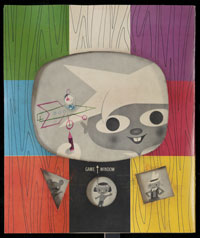
On the flip side of this screen, art critic Aline B. Saarinen elegantly holds forth in excerpts from her 1964 NBC Sunday Show segments on Georgia O’Keeffe, Alberto Giacometti and Edward Hopper. Providing art education to an increasingly tuned-in public (America went from 5,030,000 households with TV sets in 1950 to 45,750,000 in 1960) was a hallmark of early television. A section devoted to Winky Dink and You, which ran on CBS from 1953 to 1957 and was one of the first interactive television shows, demonstrates the transparent green vinyl screen and special crayons that parents could mail order for 50 cents to enable their children to draw along with Winky and his friends right on their screens.
Women were a special target audience for art education programming, according to cultural historian Lynn Spigel. The Museum of Modern Art’s Television Project, for instance, engaged with the networks to promote “modern art within a vernacular mode that spoke the language of ordinary people—particularly the housewife.”
Saarinen devoted much of her career to bringing the rarefied world of Modern art and artists into the lives of television viewers. Born Aline Bernstein in New York, she met her husband, Eero, when she interviewed him for The New York Times Magazine. She famously nurtured and promoted his projects, including Black Rock (which was completed after his untimely death), while building her own career demystifying the visual arts on the small screen and in her books (which included a groundbreaking monograph on Jacob Lawrence) and articles for Vogue, The Reader’s Digest and McCall’s. Among examples on display are pages from McCall’s featuring prints by Picasso and Matisse that readers were encouraged to remove and frame (but presumably not before reading Saarinen’s commentary on their reverse sides)—poignant reminders that high quality artistic and literary content was once prolific in women’s magazines.
That day pretty much ended—for network television, at least—in the early 1970s. One reason was the availability of video technology to artists outside the corporate environment. Video art became the new avant-garde and its proponents didn’t need the broadcasting establishment to produce or promote their work. But neither, by this time, did television need their input. “If producers and executives sought validation of the medium by attaching themselves to Modern art and ideas,” said Berger, “they were less pressured to do so in the 1970s, a time when network and educational television were increasingly recognized for the artistic quality and potential of their programming.”
But one artist continued his longtime love affair with television well into the 1980s. Andy Warhol’s involvement with the networks started in the early 1950s, when he was an award-winning designer of titles and advertising for CBS and NBC. TV personalities always figured prominently in his underground movies and his art, and he adored appearing as himself on shows like Saturday Night Live and Love Boat. So it’s fitting that he gets the last words (and images) in the exhibition, a whole roomful of them, entitled “Andy’s Fifteen Minutes.” Included is his Barbara Feldon cover for the issue of TV Guide featuring Get Smart; a screenprint of the Marx Brothers from his “Ten Portraits of Jews of the Twentieth Century” series; a lithograph of Howdy Doody from his “Myths” series; the Braniff Airways commercial in which he talks Sonny Liston into a stupor; and—the piece de resistance—his 1968 Schrafft’s ice cream commercial featuring a slightly surreal animated chocolate sundae. “We haven’t got just a commercial,” the president of Schrafft’s said of this mesmerizing little gem. “We’ve acquired a work of art.”
Nowadays, the made-for-TV work of art has become almost commonplace. Pretty much everyone who watches television is convinced that the medium is currently experiencing a golden age. But few realize that it was the original, postwar golden age that paved the way for today’s cutting-edge movies and series—from The Sopranos to Girls to Breaking Bad. And even fewer are aware that a prime mover of that three-decade cultural revolution was cutting-edge art and design. This exhibition jubilantly sets the record straight.
Andy Warhol would have loved it!
NATIONAL EXHIBITION TOUR
- NSU Art Museum Fort Lauderdale, Florida through February 28, 2016
- The Addison Gallery of American Art, Andover, Massachusetts, April 9, 2016, to July 31, 2016
- Center for Art, Design and Visual Culture, University of Maryland, Baltimore County, October 20, 2016, to January 8, 2017
- Smart Museum of Art, The University of Chicago, February 16, 2017, to June 11, 2017


 Facebook
 Instagram
 Twitter
Gordon Silverman says
Thanks to Elin Brockman, who gave me the opportunity to experience, again, the “Revolution of the Eye” exhibit through this article.